Aligning UI Design with Business Goals: Mobile Ticketing App Experience
PRODUCT DESIGN CASE STUDY
PROJECT BRIEF
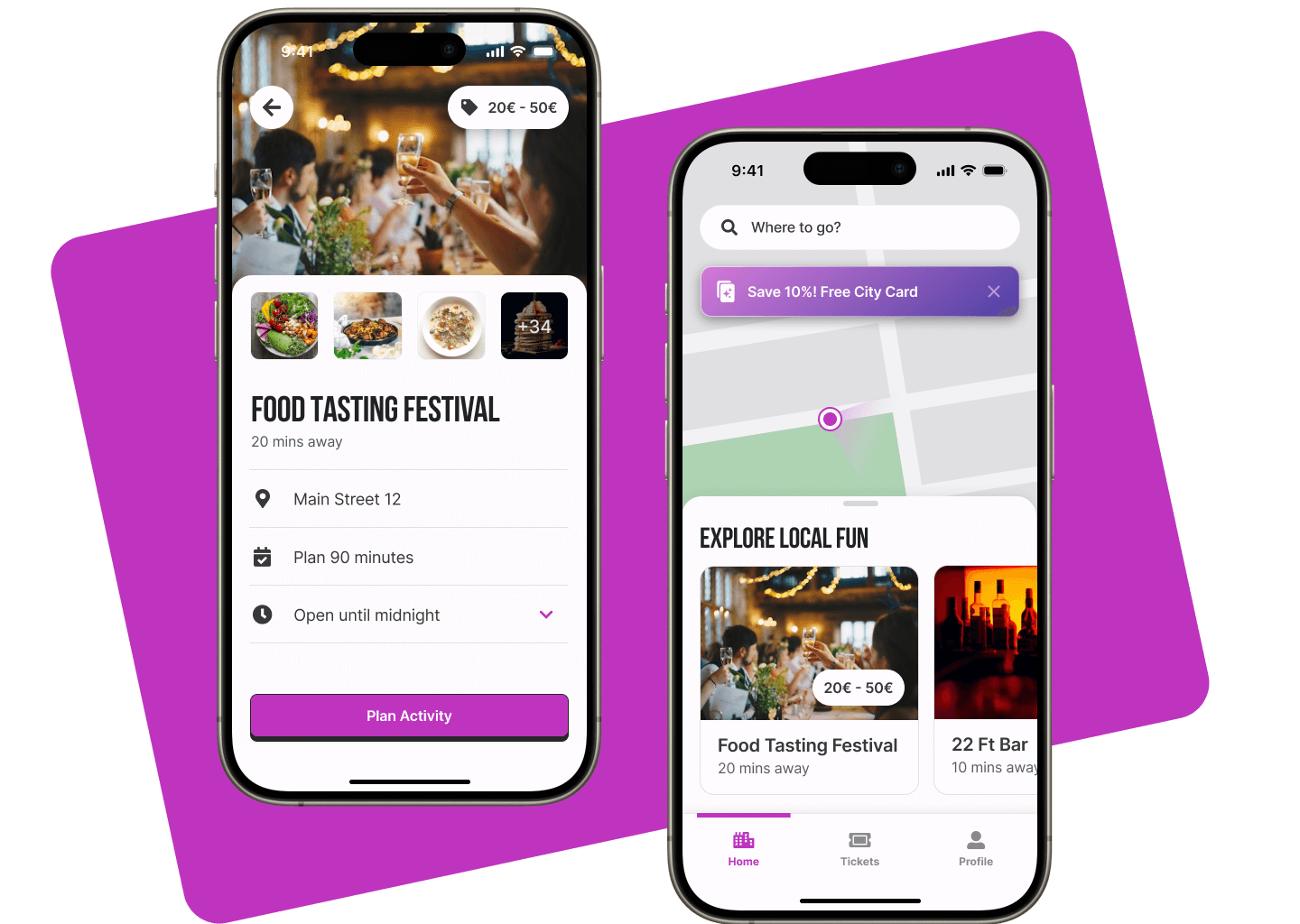
This project aimed to design a mobile ticketing app for Smart Hill, a modern European city, enhancing public transport accessibility and promoting tourism. The app integrates seamless ticket purchasing, real-time schedules, and city exploration features to encourage sustainable mobility.

Challenge
As a Product Designer, I designed a ticketing app for Smart City to attract tourists and promote public transport by enabling seamless ticket booking and intuitive city exploration.
background
I designed this project as part of my XDi coursework “Visual Design and Interaction Design”
Impact & Results
A user-centric mobile UI design that effectively aligns with business outcomes.
MY Process
1️⃣ Define Business Goals & Problem
Based on the project brief, I defined three business goals that evolve around promoting public transport in Smart Hill through seamless ticketing, enhancing the tourist experience, and supporting sustainable mobility.
2️⃣ Define UX Metrics
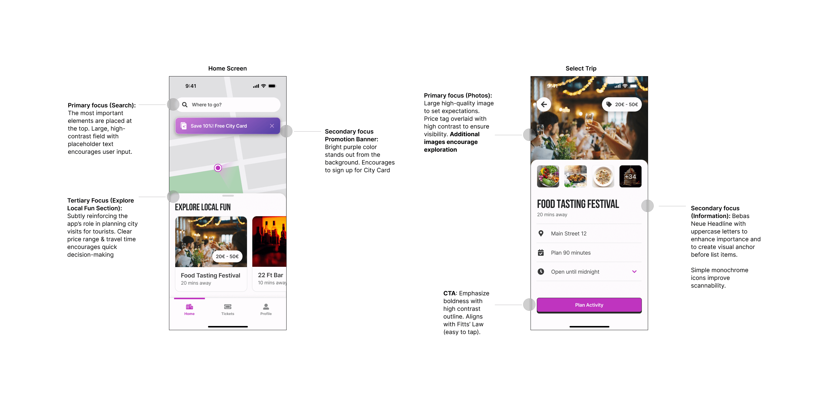
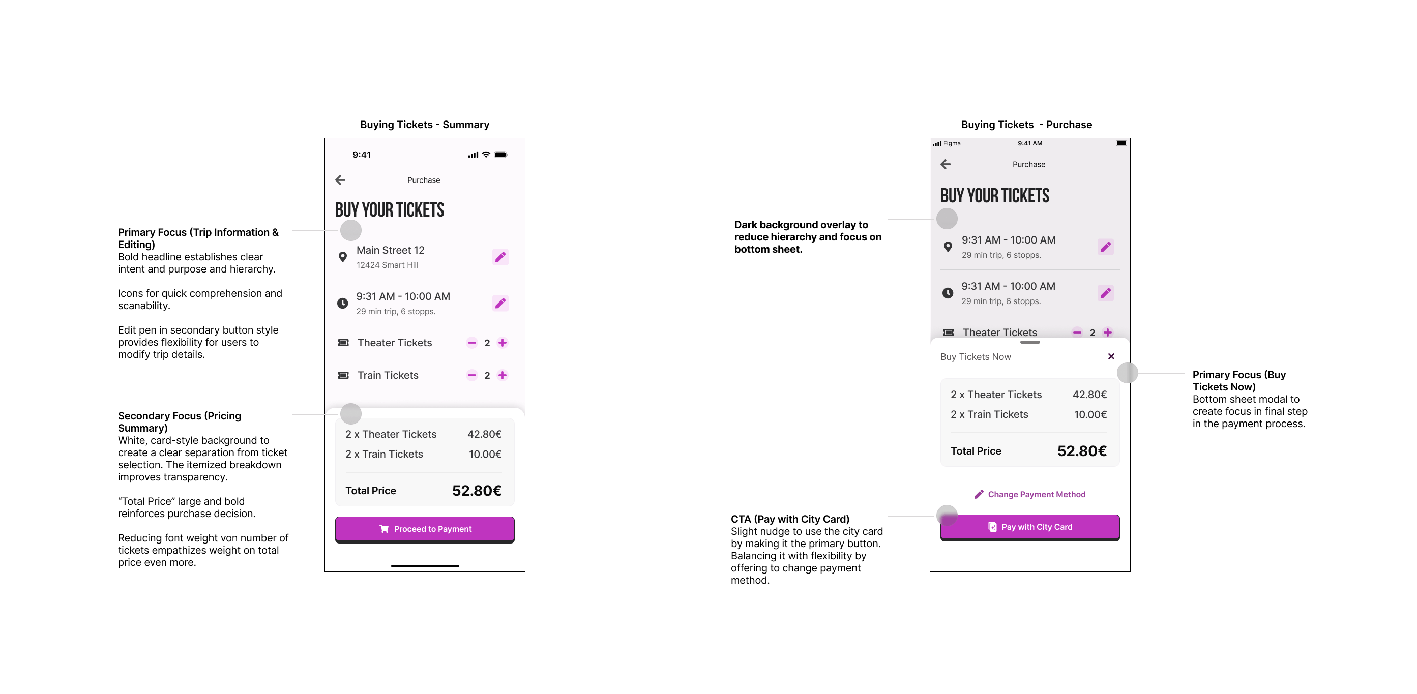
I defined UX metrics to ensure my interface designs align with business goals. I used them to guide every design decision, evaluate the impact, and question the existence of each UI element.
3️⃣ Solution Design
I designed wireframes and user flows for the most conversion-critical part of the customer journey. My goal was to balance flexibility with gentle nudges toward signing up for a City Card, optimizing both app usage and ticket purchases while improving the City Card sign-up rate.
DEFINE BUSINESS GOALS & UX METRICS
1️⃣ Design a mobile app to promote public transport in Smart Hill, featuring ticket purchases, real-time schedules, and tourist information.
2️⃣ Improve the public transport experience for tourists to plan their city visits.
3️⃣ Contribute to sustainable mobility by making public transport more attractive for regular usage.
UX METRIC:
Increase the percentage of ticket purchases via the app by 25% within 6 months
UX METRIC:
Increase average session duration for tourist users by 30% within 4 months
UX METRIC:
Increase City Card sign-ups by 30% within 6 months
SOLUTION DESIGN
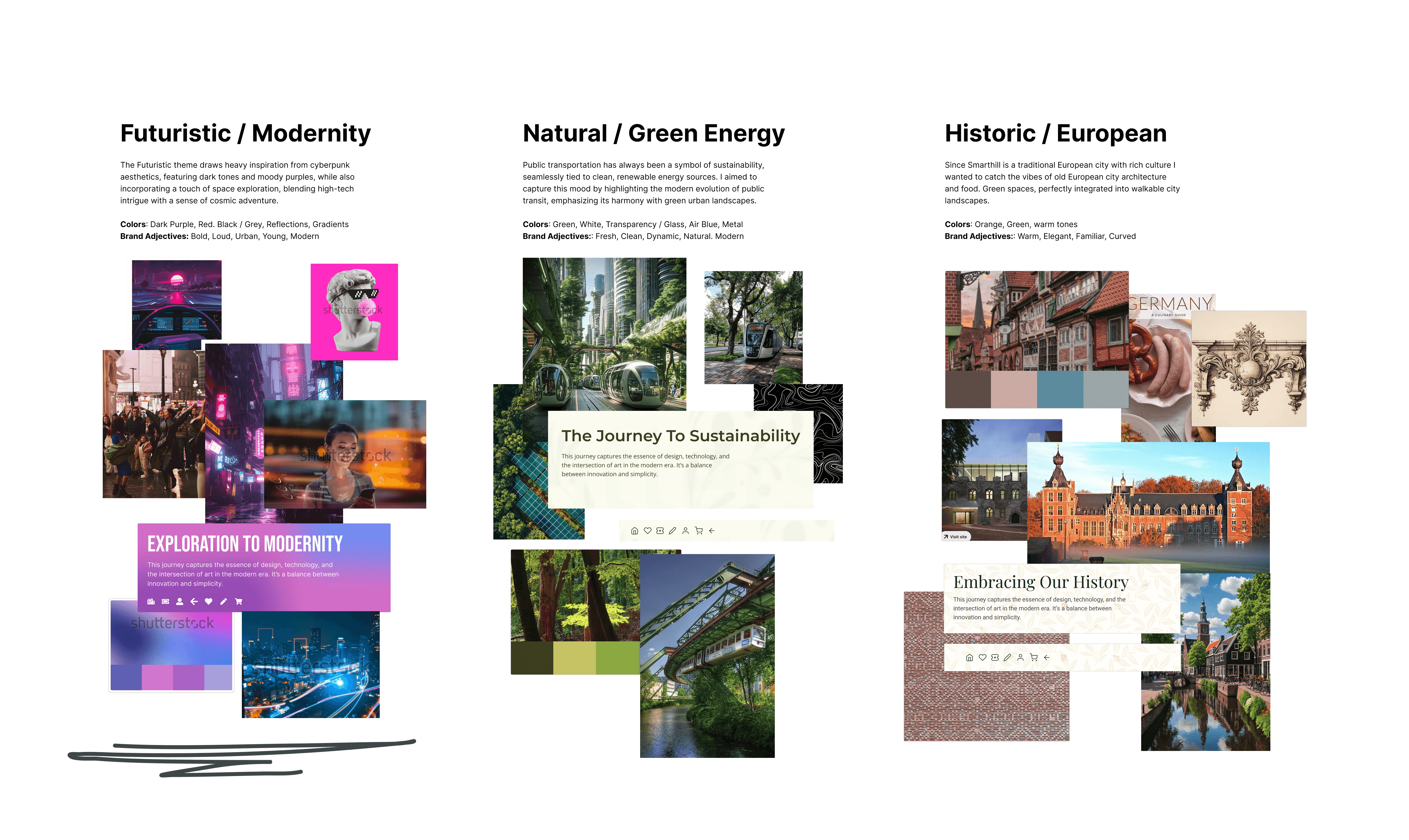
I began my UI design process by defining the brand identity through mood boards, opting for a modernistic appeal to resonate with my target audience of young students and tourists. Throughout the interface design, I consistently referenced the mood board to ensure the user experience aligned with the intended emotions.


REFLECTION
- Developed a stronger understanding of visual hierarchy, typography, and color theory in UI design.
- Understood the importance and developed a more structured approach of aligning design choices with business goals and success metrics.
LEARNINGS
- I learned how to use a mood board to establish a clear design language and identity. This simple step provides a strong foundation, allowing me to continuously ask, “How do I want users to feel?” or “Does this align with my brand attributes?”
- Defining success metrics from the start helped me make intentional design decisions, ensuring that every UI element contributed to the project’s goals. This approach kept the design both purposeful and results-driven.
